Design That Works
Category: Features
The streets surrounding the University of Baltimore campus have always been lively, filled daily with thousands of residents, students, professionals and travelers. In fall 2009, these busy streets became even livelier—in an artistic sense this time, thanks to the University’s colorful UB Midtown banner and poster campaign.
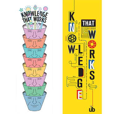
The campaign—80 banners on city light poles, five banners on Gordon Plaza and countless posters in University buildings—featured original works by renowned designers and illustrators tasked with creatively interpreting UB’s Knowledge That Works tagline. Not only was the initiative well received by the UB community, but it also helped to define UB’s physical footprint, known as UB Midtown.
The second iteration of the campaign debuted in October 2010 with illustrations by four different graphic design icons: Seymour Chwast, Paula Scher, Gail Anderson and UB’s own Ed Gold, professor in the School of Communications Design.
We recently had the opportunity to tap into two of these award-winning creative minds to learn how they turned UB’s Knowledge That Works tagline into dynamic, functional works of art. Gigi Boam, director of UB’s Office of University Relations, worked with the designers to bring their concepts to life. She later followed up with married couple Scher and Chwast at their New York offices.
Seymour Chwast is the co-founder (with Milton Glaser and Edward Sorel) of Push Pin Studios and owner of the Pushpin Group illustration and design firm. His notable work includes illustrations for The New York Times Magazine, Atlantic Monthly, Time magazine, Mobil Oil, IBM, General Foods and CBS. His posters are in the permanent collection of the Museum of Modern Art, among other museums.

Seymour Chwast
Gigi Boam: What was your reaction when I approached you about the UB campaign?
Seymour Chwast: Hey, there’s another job. I love to solve graphic problems.
What were the challenges?
The proportions were rather extreme, [and] there were three different sizes. I had to find a way to satisfy all.
Explain how you developed your idea and incorporated the tagline.
There are symbols for higher education, there are symbols for knowledge. Those things may have swirled around in my head. You find those things that suggest metaphors … [and] put them together to make one image; that’s a way to solve a problem.
The top head with the bouquet of flowers coming out—that I knew would tie in with the headline. That’s the payoff.
How do you hope people react to your design?
Well, if they smile profusely. It’s nice if I do a magazine cover and you see someone reading the magazine on the subway. It gives you a great deal of satisfaction to see your work out there.
Have you ever worked on another project that involved several illustrators/designers? Sure; I do my best and hope my solutions are better then everyone else’s. You know, there is the competitive spirit that applies here.
Do you and Paula [Scher] ever collaborate on projects?
We tried it a long time ago and found out we couldn’t work together. When you have two pretty strong personalities, especially like Paula’s, it’s hopeless.
How do you react to the many designers who try to emulate your style?
You mean someone that has ripped me off? You might be flattered but think, ‘Why didn’t I do that job?’ There are times I’ve been asked to do something—maybe they wanted Saul Steinberg, but they couldn’t get him, and they would tell me that. So they called me because they thought my style was the closest to his style.
How long have you been in this business, and how are you best known?
My first job was in 1951. People are totally different; everybody has a different idea. I’m old hat to a lot of people, while others think I could do no wrong. In the meantime, I lose a lot of business because they’re afraid to call me or [think] it will cost them too much or [that] I’m over the hill and can’t do anything good anymore. So that’s a problem.
Paula Scher is a partner at the New York City office of Pentagram, an international design consultancy. Her notable work includes identities for the Public Theater, Citibank and Tiffany & Co.; record covers for CBS and Atlantic records; and environmental (space) design for the New Jersey Performing Arts Center. Her work is part of the permanent collection of the Museum of Modern Art and other museums.

Paula Scher
Gigi Boam: What was your reaction when I approached you about the UB campaign?
Paula Scher:I’m certainly aware of the University, and I was glad you asked me to do it. … I like making posters and banners.
What were the challenges?
Can I be honest? As a designer, I really hate slogans; I find them very limiting to work with. In general, I would have preferred using ‘UB’ because I think it could develop its own sense of spirit and bring your own meaning to it more than the slogan can do.
How did you develop your concept?
I realized the best thing to do was turn it into some kind of machine [with] some action that seemed to illustrate the words but was also separate—so you would read it as some kind of energetic compilation of information that you would relate to UB.
… I perceive these things as something you emotionally respond to on the street. If you’re just reading it and you’re getting the message, it’s a drag, it’s a bore, people would just walk past it. The question is: How do you make somebody become attached [to] or respond to the message visually? I was looking for a kind of kinetic activity … that felt like, ‘Oh, this must be an exciting place to go to.’

(l. to r.) Banner designs by Seymour Chwast and Paula Scher
What reaction to your banner design would please you the most?
‘What’s that?’ That’s the best reaction you can get, because then they find out.
Have you ever done a similar project?
All the time—I work for every cultural institution in New York City, a lot of schools, Madison Square Park, the Museum of Modern Art. It’s what I do for a living: banners, posters, buildings, things that give people a sense of identity.
How long have you been in this industry, and how are you best known?
About 40 years. If it’s an older generation, they probably still know me for record covers. If it’s people in their 30s to 50s, probably the Public Theater or maybe the environmental design. If it’s a young kid, I think that they just know the name.
How does it feel when you see work you’ve done, even years ago?
I’m charmed by the record work; sometimes I run up against it in an antique store. I remember doing it, but it’s like a million years ago; they’re just relics.
I hate when I see something I did about five years [ago]. When you see something you did about 35 years ago … you’re not as critical about it.
WebExtras

Design That Works
Learn more about the two other designers who contributed illustrations of the University's Knowledge That Works tagline to the 2010-11 UB Midtown banner and poster campaign.

