Design That Works
Category: WebExtras
Gail Anderson and Ed Gold , both graphic designers and educators, contributed their illustrations of the University’s Knowledge That Works tagline to the UB Midtown banner and poster campaign. Gigi Boam, director of UB’s Office of University Relations (and Gold’s daughter), caught up with the two designers for their takes on designing for the campaign and on the design industry, in general.
Most recently the former creative director of design at SpotCo, Anderson also was the senior art director of Rolling Stonemagazine from 1987-2002. She’s the recipient of the 2008 AIGA Medal for Lifetime Achievement and serves on the boards for the Society of Publication Designers and Adobe Partners by Design.
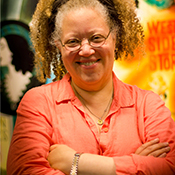
Gail Anderson
Gigi Boam: What was your reaction when I approached you about the UB campaign?
Gail Anderson: I’ve done several projects for the School of Visual Arts, where I attended college, and I’ve taught there for probably 20 years now. It’s been fun to be connected to the school—but it was great to be asked to work on something for another institution. I’ve never done anything for another school, ever, in the 25-plus years I’ve been working.
Why were you interested in UB’s poster and banner campaign?
I thought the tagline was dead on. I’ve been teaching for a long time, and I really enjoy working with adults, since I relate to their struggles. I appreciate people attempting big life changes. UB students are looking for career advancement, and know what it’s like out there already. They’re prepared to take their studies seriously.
What were your influences when developing your design for the campaign?
I worked with my former art director at SpotCo, Darren Cox. He’s easily 13 or 14 years my junior, and I wanted to collaborate with someone who was closer to the college and continuing- education experience than I am at this point (sad but true). We attempted to create something that felt fresh, but not trendy. And since we’ve grown accustomed to working with outdoor spaces, simplicity was key.
What was the process you went through when developing the idea for the campaign?
The art needed to be a bit playful, and the question-and-answer bubbles seemed like good metaphors for ideas and solutions. The hands holding the elements added a human touch, and we went back and forth on gender and race a few times. We actually auditioned a few hands around the design department, which was silly fun.
Do ideas generally come quickly or do you like to think about projects for a while?
I really enjoy letting ideas percolate, but when it comes down to it, I need to pop out a few pretty quickly so I don’t stay inside my head too long, which leads to panic. My training from
The Boston Globe
to
Rolling Stone
and the bulk of my career has informed the rest of my work, and so ultimately, I prefer to get in and out. But my nine SpotCo years were about change and refinement, so I learned to slow down and generate more ideas rather than settling quickly. It was a great late-in-life education.
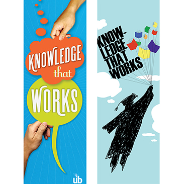
(l. to r.) Banner designs by Gail Anderson and Ed Gold
What type of reaction would please you the most when people come across your design for the banners and posters?
Who wouldn’t want a smile? And if somebody wanted to swipe a banner or poster to keep for themselves, that would make me even happier. But I’ll pass on the graffiti.
What are the challenges specific to developing promotional material for nonprofit organizations?
Creating a product that’s ultimately unique to the institution is always a challenge. And doing it within the given dollars is sometimes even harder. You want to brand the institution without being predictable.
What do you think you are best known for?
Probably my hair, which is a big floppy mess. And people certainly ask me what it was like to work at Rolling Stone, so maybe that’s the thing I’ll be best remembered for, since that’s the most familiar.
Rolling Stone
is a very different genre than the work you subsequently produced at SpotCo. What were your challenges in the transition?
I didn’t think there would be as many challenges as there were. I thought I made spreads that felt like posters, so the difference would be minimal. But ultimately, the transition was far from easy, since I had to learn a whole new genre and gain trust from a whole new cast of characters, from coworkers to producers. The deadlines were longer, but there were a lot of speed bumps on the way to wrapping up a project, which was new to me. I was juggling projects that appeared to go on and on and on, which was sometimes frustrating. But I learned so much about advertising and marketing—really strategizing before designing.
How has technology influenced your work?
I wish I had more technical skills than I currently do—I once was able to do more for myself, and [more recently I] have had to rely on others to execute things, which is increasingly frustrating. But since I’m now on my own, at least for the time being, my plan is to get caught up on [Adobe] CS5 and maybe even tackle learning about iPad apps. That’s much more intriguing to me than the Web, though perhaps I’m just in love with the iPad itself.
What are your greatest weakness and your greatest strength as a designer?
I’d like to think that my body of work still holds up; that it’s not particularly trendy. But I look at the exquisite work of someone like [celebrated restaurant and food-packaging designer] Louise Fili with great envy. I don’t have that delicacy at my fingertips and can sometimes design with the volume turned up a bit too high. I can’t do the beautiful stuff without adding a punch line or a wink. But I’d like to take the next few months to do a little reinvention, so we’ll see what happens. Maybe I’ll go classy after [turning] 50.
Gold, who has been in Baltimore’s design industry for more than 60 years, was the former creative director at the Barton-Gillet Co. from 1956-92 and has been a faculty member at the University of Baltimore since 1980; he is now the director of the M.F.A. in Integrated Design program. While working at Barton-Gillet, he received more than 400 awards for the groundbreaking designs he created for various institutional and corporate marketing publications. In 2009, he was honored by the Baltimore chapter of AIGA with the first Lifetime Achievement Award for his contributions to the design industry.
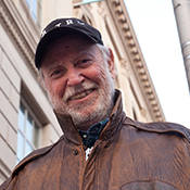
Ed Gold
Gigi Boam: What was your reaction when I approached you about the UB campaign?
Ed Gold: I was flattered, and I was curious and astounded when I found out who a couple of the other designers were. Paula Scher and Seymour Chwast are two of the giants in design and great, great illustrators. So, I was very, very humbled, but also challenged. I felt that if I’m going to do this, I want to do it as well as they, and I always like challenges. I also saw it as an opportunity. I don’t often get to do illustration anymore; it was nice to get a chance to do it, and [it] gave me an opportunity to learn a program like [Adobe] Illustrator a little better. I started feeling pretty competitive, which is always good for designers.
What were the challenges?
The first challenge is that the banner exists in an environment that’s very different from a book or a poster or the things that you normally work with. … What do you do for a banner to make it visible and to sell an idea to get the message across? Most things you do are going to be held at either arm’s length or, if it’s a poster, maybe four or five feet away. But a banner is up there, 10 to 15 feet in the air.
What was your process in developing your design for the banners and posters?
I started with the assumption that my big problem was going to be the banner because that would be seen by most people. … In this case, I felt the problem was designing something to go against a background of sky. I always like to design things that have an “aha” effect, where the reader doesn’t quite see it immediately, there’s a moment of ambiguity … and then they get it and they become a partner.
The problem was: How do you convert Knowledge That Works into something visual? That was a little easier, because I do what a lot of designers do. I asked myself, “What are all the visual things that I can associate with ‘knowledge’? What are all the visual things that I can associate with ‘works?’” I made lists, tried connecting all kinds of words, and eventually I came up with something fairly simple. I decided that “knowledge” was going to be represented by someone dressed in a graduation robe. “Works” means that someone actually figures out what they want to accomplish and how they can accomplish it. … How does that look? … I ended up with a graduate kind of reaching up and floating off into the sky, achieving some goal.
The other bottom line is how to make it look good. I tried lots of different versions. I tried a rough version, a smooth version, I changed the figure a lot, but eventually I realized that it was more interesting and more exciting to go with a rough drawing. And that’s how it ended up.
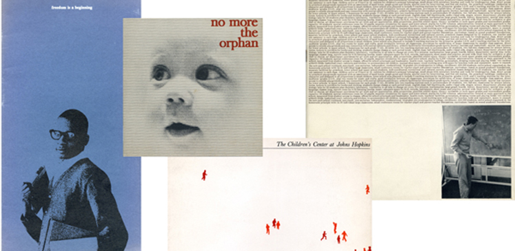
Gold’s extensive collection of work includes these examples from earlier in his career, designed for (l. to r.) Fisk University's Centennial Development Program, the Family and Children's Society, the Children’s Medical and Surgical Center at Johns Hopkins Hospital and the construction of the then-new Park School.
What type of reaction would please you the most when people come across your design for the banners and posters?
If I can get the reaction that I was reaching for—“What am I looking at? That’s a little strange; I see somebody flying in the sky.”—I’d be delighted. If that person also likes the artistic value of it—Is it pretty? Does it look good? Is it well done?—if I can get both those things going—it’s beautifully done; it adds something beautiful to the environment; and it adds a connection to the reader, the viewer and the idea—then I’d say that I nailed it. They are participating, they’re part of the process, become part of the club; there’s a secret handshake involved between the person who creates it and the person who sees it. That would please me, that’s 100 percent.
What do you think is your most important responsibility as a college professor who teaches rising stars in the design industry?
Early in my career at Barton-Gillet, it was very similar. We would bring in young designers, and I would work with them and try to get them to do their best work—I felt so good when it worked. When I see a Dave Ashton [of Baltimore’s Ashton Design] grow and become the kind of designer he is today, I [feel] kind of responsible. Clearly, he had to have the talent, but by my pushing him and setting the foundation for this, I can share in his achievements. That’s what has happened here [at the University of Baltimore]: By my teaching young designers and pushing them, if they succeed and they can get good at it, then … I share that kind of happiness. It’s the greatest job in the world, being a design faculty.
What are your greatest weakness and your greatest strength as a designer?
The list of weaknesses is much longer than my strengths, so I’ll start with those. I certainly know that I’m not as strong on the computer and on all the software that I need to be. This is the result of a couple things, one is age. … As long as I’m dealing with ideas, as long as I’m dealing with things I can sketch, I don’t really have to worry about it. If I have to convert them [to a digital format], it’s not impossible for me, it’s just harder and takes longer.
But I have many other weaknesses: I can be harsh, I can be abrupt. I can be all those things that can just drive the students crazy. I get two reactions from my students: Some are thankful that I get right to the point, that I’m very direct and don’t beat around the bush. Others get their feelings hurt. I really try not to do that, but I just don’t like the idea of avoiding the obvious. … I’m beginning to be a little softer, [but] I’m still pretty blunt. Instead of saying, “That’s crap,” I say, “It’s very, very good … but it’s still crap. Try doing it this way.”
I think one of my strengths is that I can come up with ideas really quickly, probably just as a result of having done it for so long. I have a big database to choose from. I also think I have a very good eye. I think I can design things that look good but also communicate the message well. But I think my biggest strength is in recognizing talent. I can see little things: the way they handle a line of type or color relationships. I can tell very quickly if a person is going to be a really good designer given the right kind of exposure, the right education, given the right kind of pushing. A lot of people can design better than me—things that look better, things that are more exciting in some ways—but I think I’m as good as anybody could ever get at spotting talent.
How does it feel when you see work you’ve done, even years ago?
I look through that box sitting over there, and I see work that I did 40 years ago, and, incredibly, it still looks good and it still works well; it would be good today in every way. Which says there’s something about longevity to good design—it lasts. Even though type fonts may go in and out of favor, if it’s a good idea, beautifully handled, it goes on forever.
What are you best known for?
I guess I’m best known for having turned out a lot of really good designers into the Baltimore area. I’m best known for having contributed to creating what has amounted to a whole industry in institutional marketing—an industry that has stayed right here in Baltimore. So, I’m veryproud thatI’ve had something to do with the creation of an entire new industry—in the design industry, not just any industry. I’m also proud that I’m identified with that by the local community.
Read the Main Article

Design That Works
Take a look at the UB Midtown banner and poster campaign with illustrations by design icons: Seymour Chwast, Paula Scher, Gail Anderson and UB’s own Ed Gold

